Sprectra AD - alcohol marker in test
Share
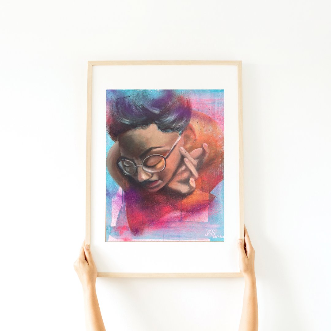
My first picture with marker
after more than 10 years - if I had approached the matter with the mindset I have today - it could have turned out well.
During my fashion design studies I had to paint with alcohol markers - yes, you read that right, I had to. From the second year onwards we were supposed to work "professionally". Before that everything was allowed - watercolour, gouache, coloured pencils...
Certainly, if you are working in design and need to come up with drafts quickly, then the markers are super practical because they dry almost immediately. And real experts can use them to create smooth, flowing transitions like in a watercolor - but unfortunately I was not an expert. But that was also due to the sledgehammer method with which these markers were introduced. From then on, I was no longer allowed to design anything with watercolor, but had to resort to the markers. The starter color palette was initially specified by the lecturer - with the price of the markers, I lost the food money for two weeks. And I hadn't even bought the refillable version of the Copic markers.
On top of that, the color palette wasn't my thing. Even with multiple layers, I never got the colors I needed. Transitions never looked good. In fact, everything looked like a coloring book scribbled out by a frustrated child - only the expression was missing. Today I have to say that the markers never had even the slightest chance with me because I blocked myself out.
The Upcrate 37 came at the right time
One of the reasons I have these boxes is to get myself out of my comfort zone - so here we go. The 37 included:
-
Spectra ad double-sided alcohol markers in Straw Yellow, Pink Beige, Yellow Ochre, Arctic Blue, Columbian Blue and Spring Green
-
a Marvy Uchida fineliner in black, thickness 0.3
-
a Marvy Le Plume pen in white with opaque ink
-
3 Bruynzeel Design coloured pencils in Yellow Ochre, Dark Violet and Sanguine
-
an A5 cardboard Bristol drawing board pad with 15 sheets from SMLT Art
The Spectra ad markers are significantly cheaper than the Copix, the two refillable versions Copic classic and Copic sketch. Their shape is similar to a square version of the sketch markers - I think that's a good thing, they stay where you put them. Yes, I know, the round markers from Copic have tabs on the cap to prevent them from rolling away - but square ones definitely roll even worse. Despite their shape, they fit well in the hand. The flat side is marked with a gray border so you can see at a glance which side you have to open. Since they are refillable and cheaper to buy initially, I would choose them over the Copic.
The fineliner and the ink pen were great - in my opinion, the fineliner even surpasses my beloved Pigma Mignon fineliner. The Bruynzeel colored pencils give off good pigment, but fall behind premium pencils like Polychromos, Luminance or Prismalcolor. I find the tips a bit brittle, and if they are sharpened too much, some of them quickly flake off. However, they paint pretty well.
The paper - it is Bristol cardboard. If you read my product descriptions carefully, you will see that I draw my portraits on this paper. The quality was very convincing - but it is not marker paper. It is thick enough to withstand several layers of marker, but not optimal.
I'm attaching a video in which I unpack the box and test the materials. Let me know your experiences with alcohol markers or the other materials.
Creative greetings,
Sabrina